Brand Identity
PUNCH.
Coffee shop identity
About the project
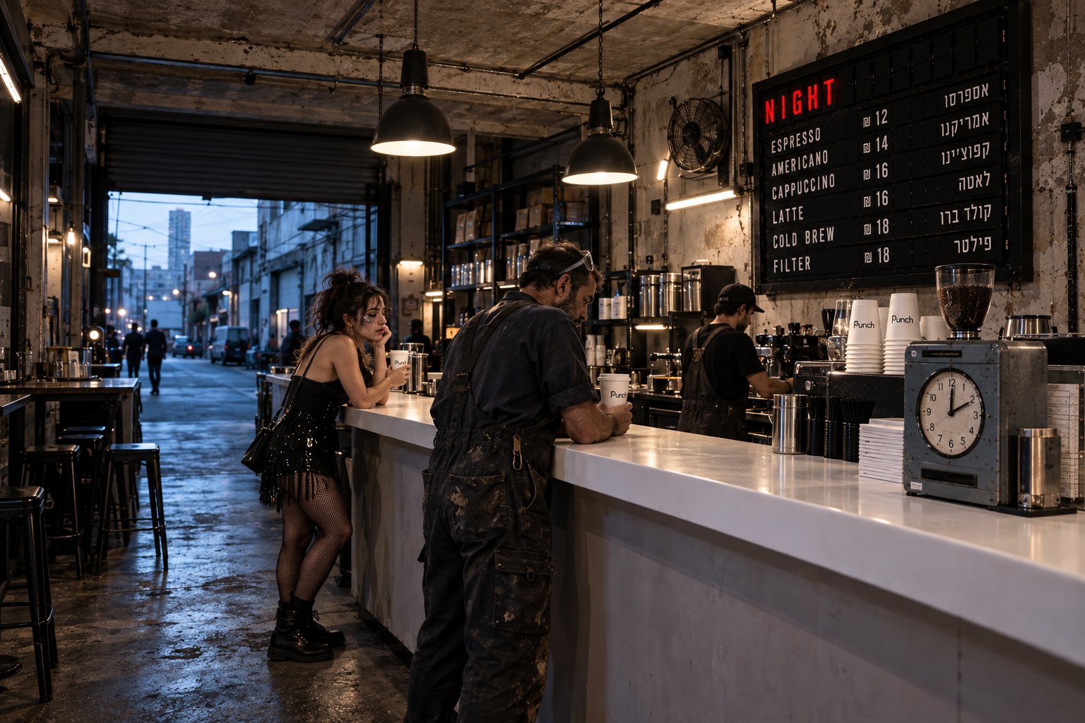
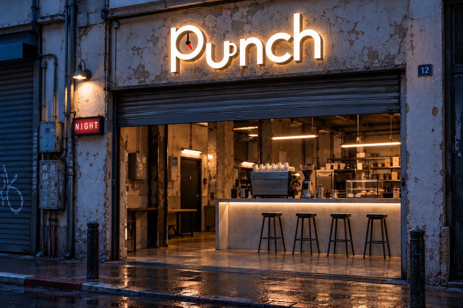
Identity for a coffee shop in a former metal workshop. At five in the morning two shifts meet here: one is leaving the bars, the other is going to open the workshops. PUNCH opens at exactly that hour. The line: Open between shifts.
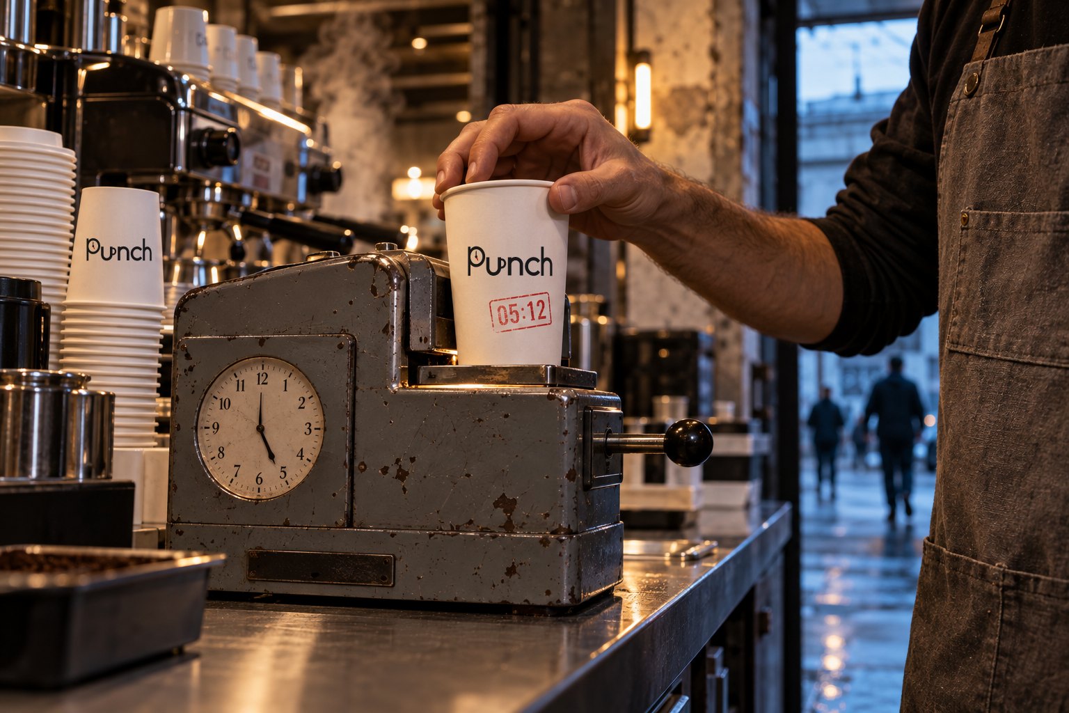
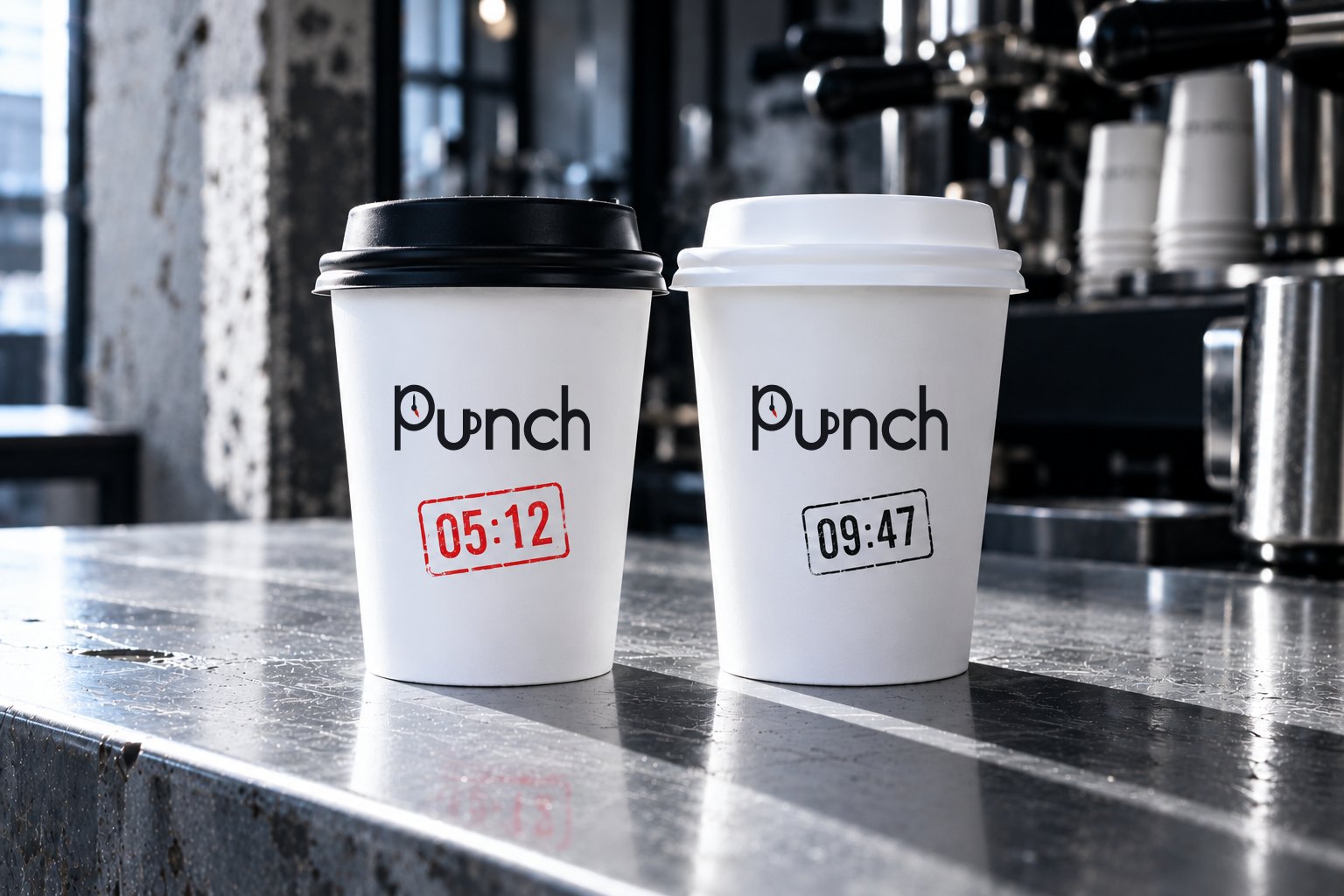
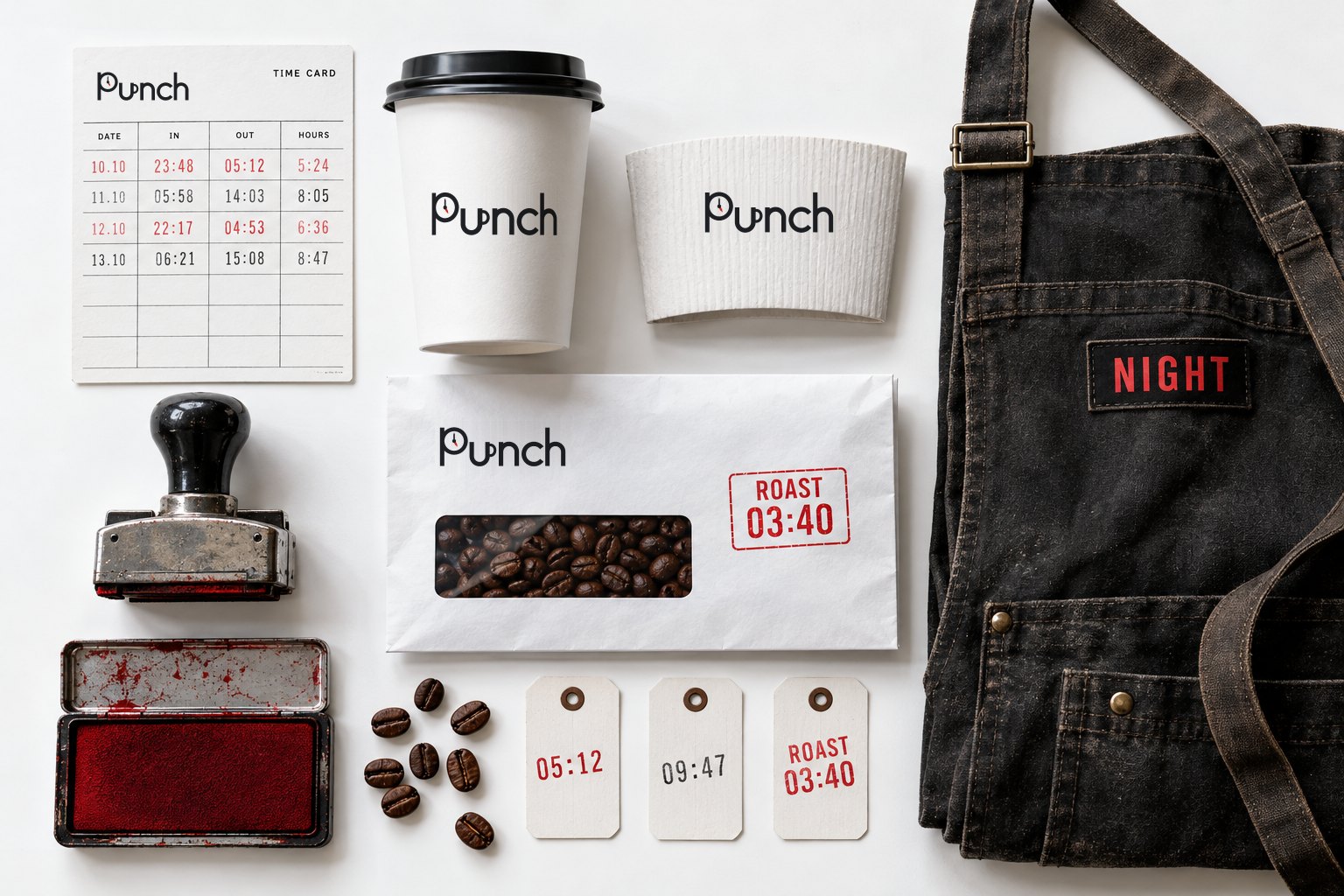
The brand is built on the time clock. Every cup is punched in a real clock on the counter and carries the time of the order: red at night, black by day. That is the only colour rule. In the wordmark the bowl of the P is a clock dial with the red hour hand on five, and the u is a mug.
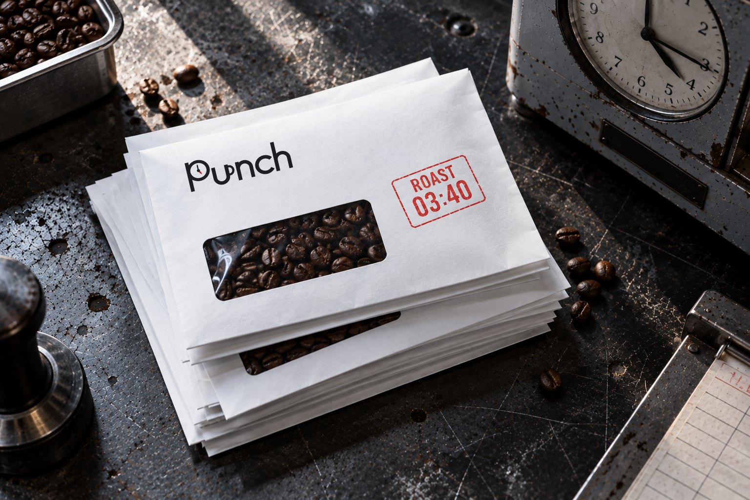
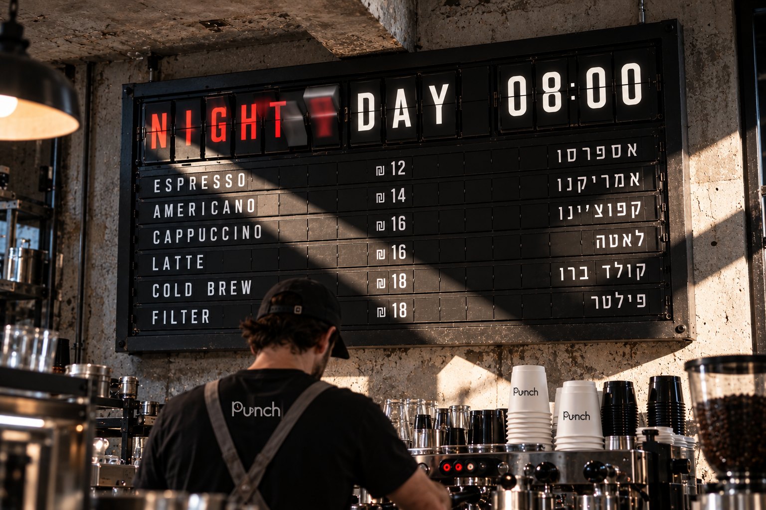
At eight a split-flap board flips the menu from night to day. Beans are sold in pay-packet envelopes stamped at roasting, and the loyalty card is a time card.