Brand Identity
DAKA.
Meditation centre identity
About the project
Identity for a meditation centre. דקה (daka) means both “a minute” and “thin”, and the two meet in the line קול דממה דקה, “a still, thin voice”. The centre does not promise enlightenment. It offers one minute.
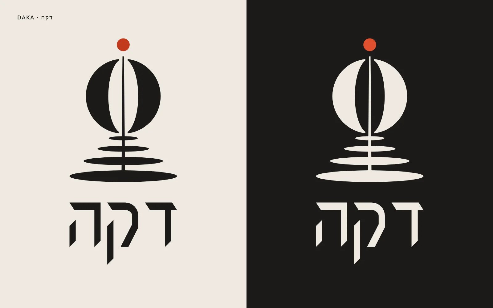
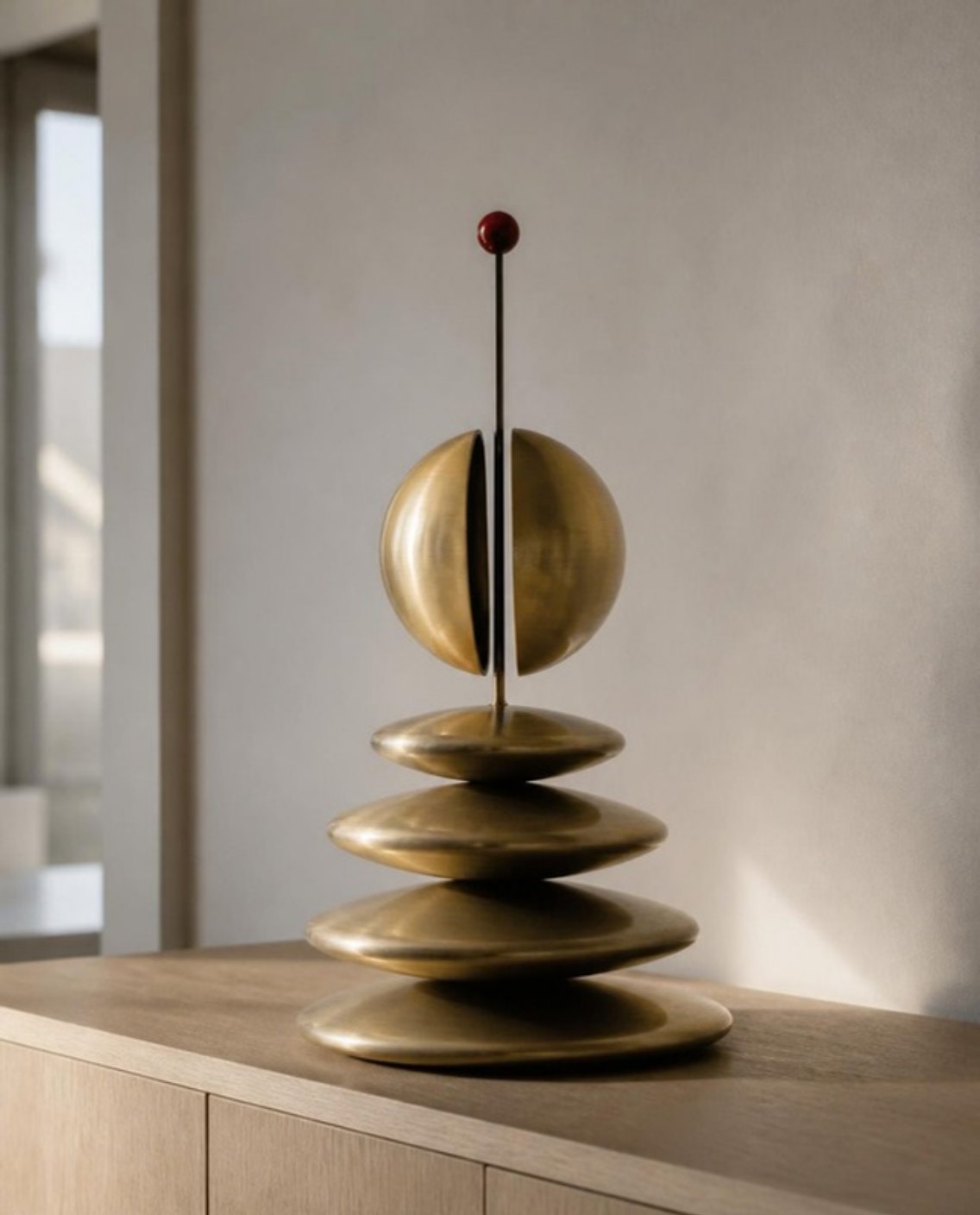
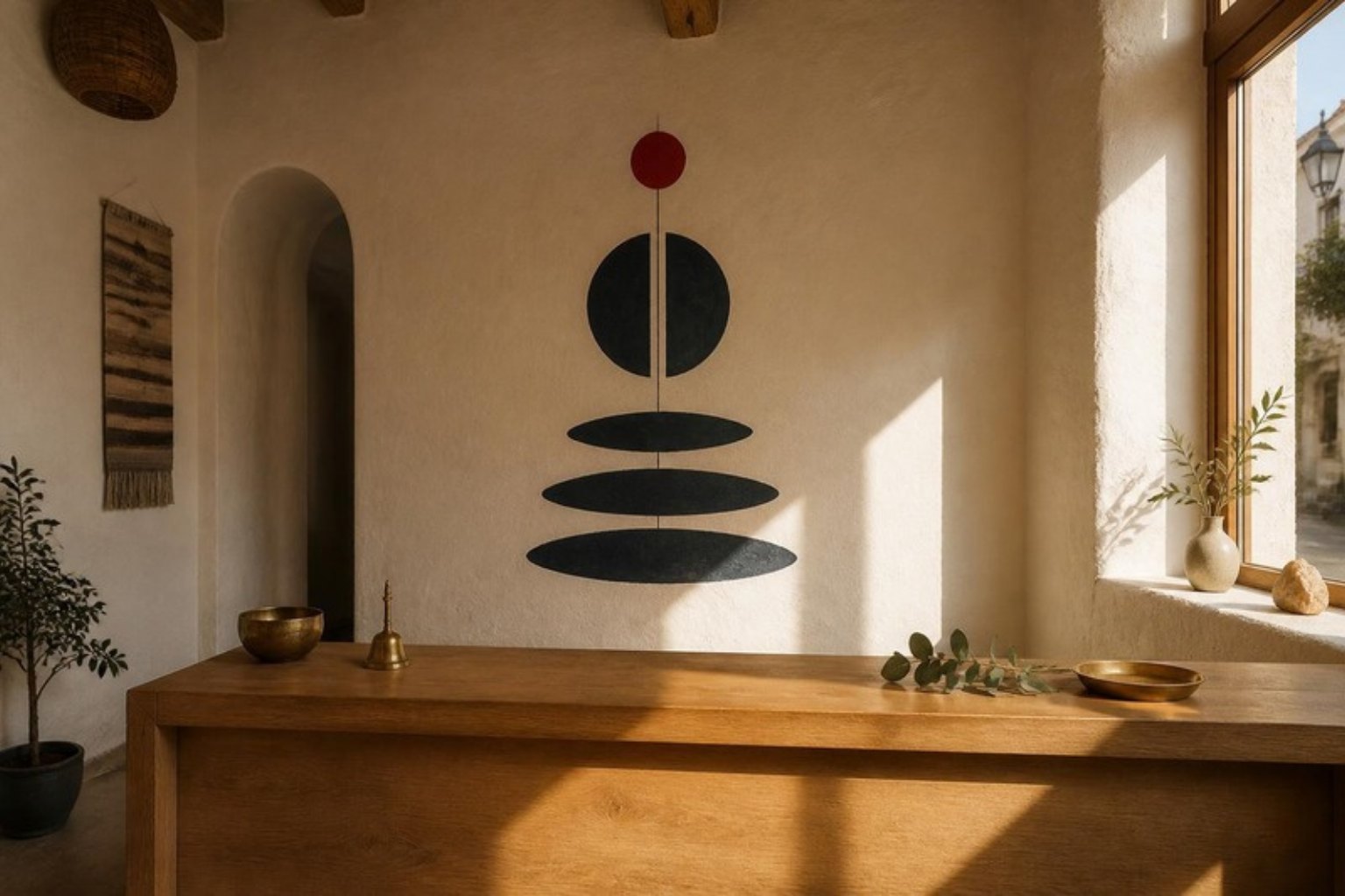
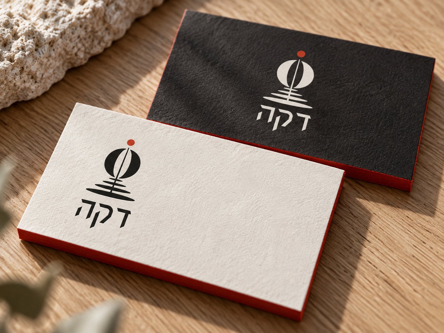
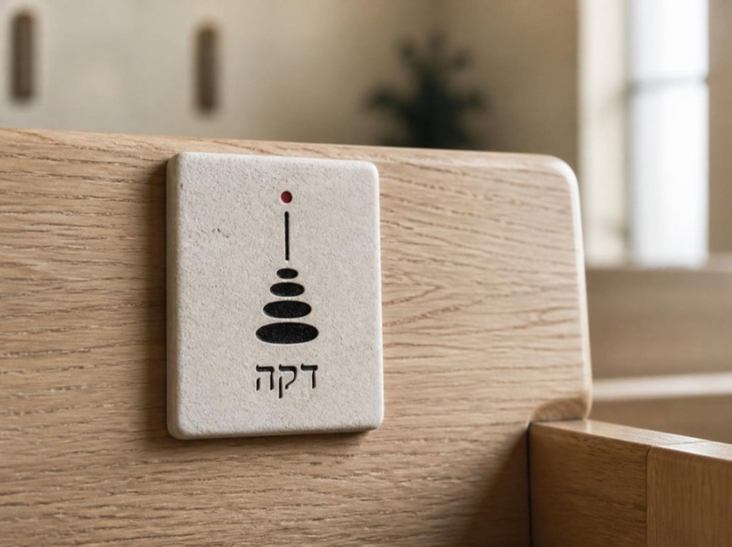
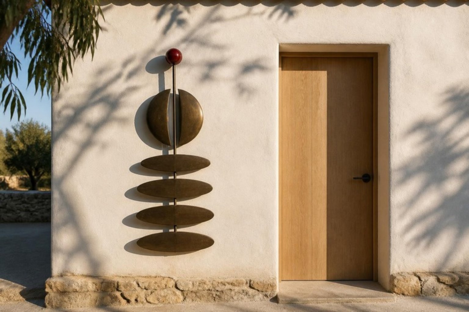
The mark is balance: a red dot resting on a needle, a split sphere and a stack of stones. Every practice is a stone, and the width of the stone is its length in minutes, so the schedule, the signs and the membership card are built from the same blocks.
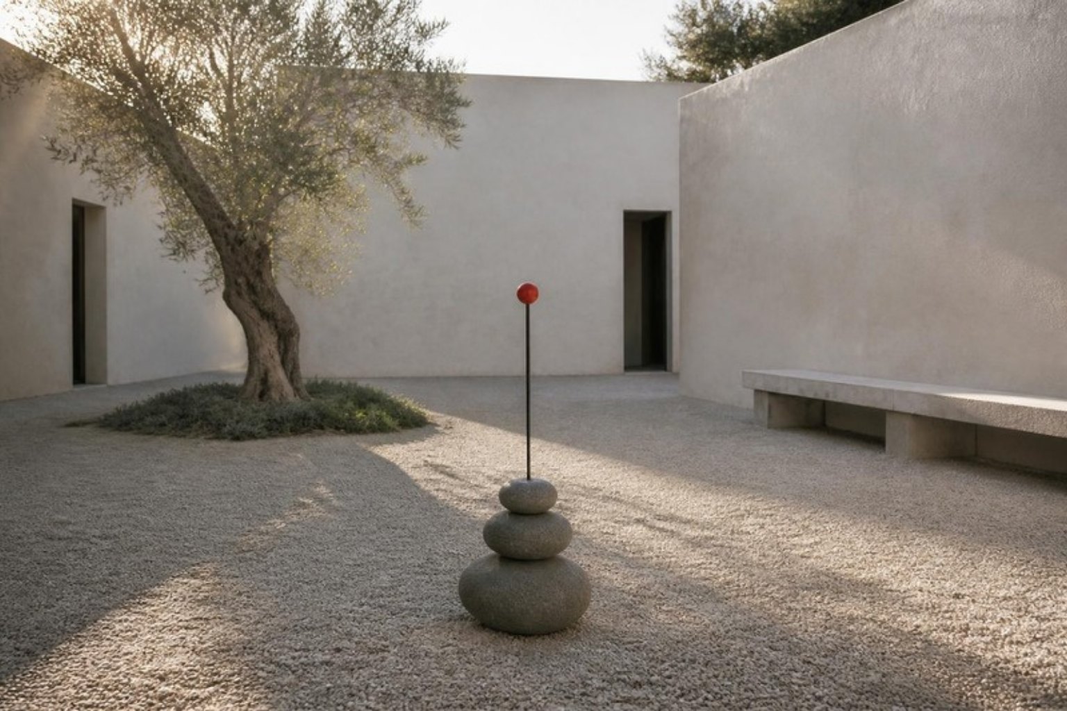
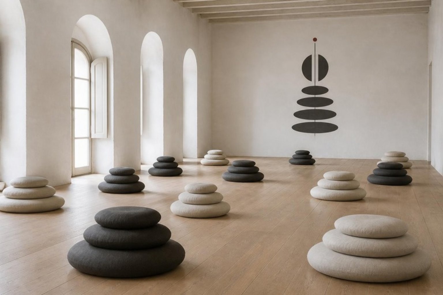
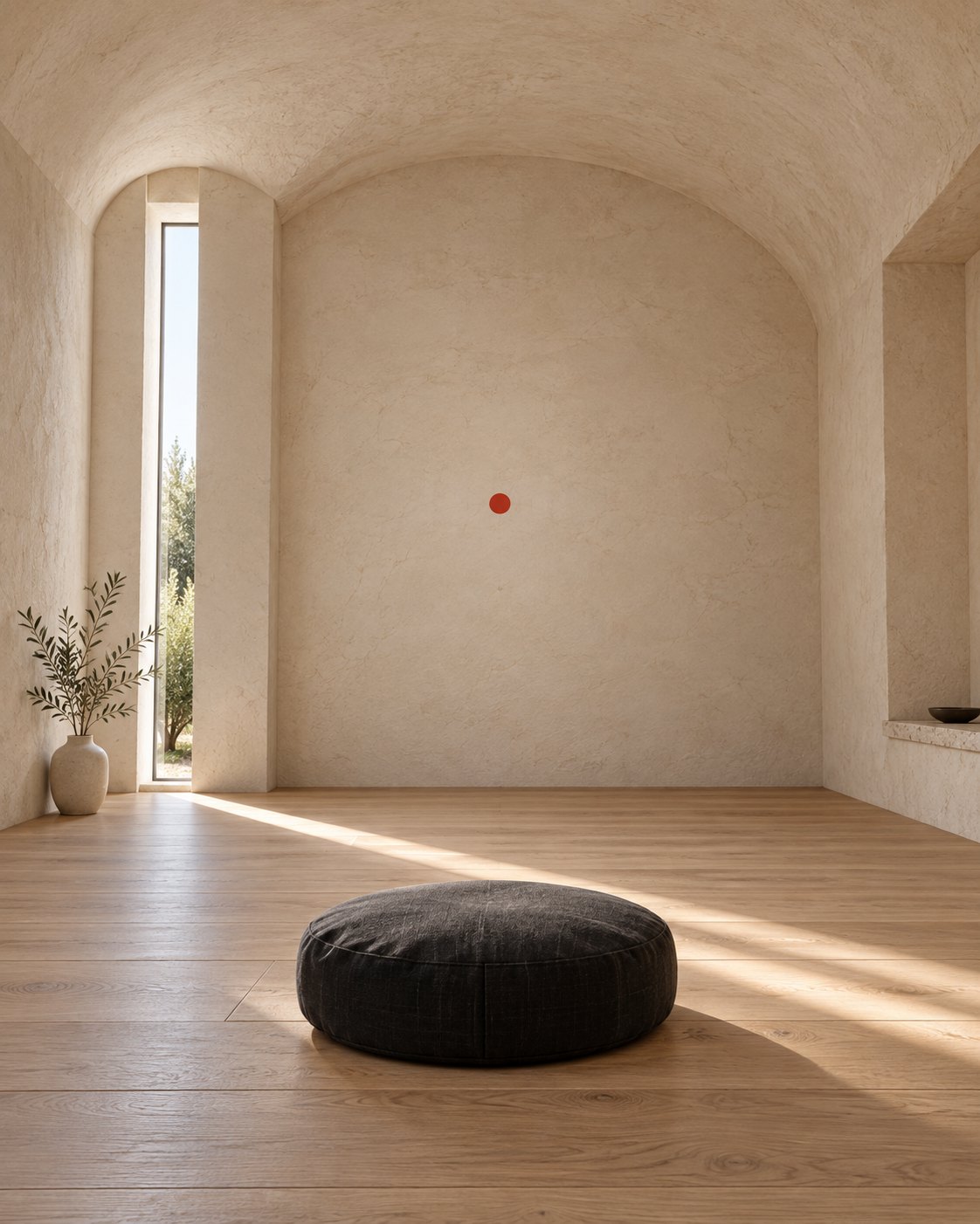
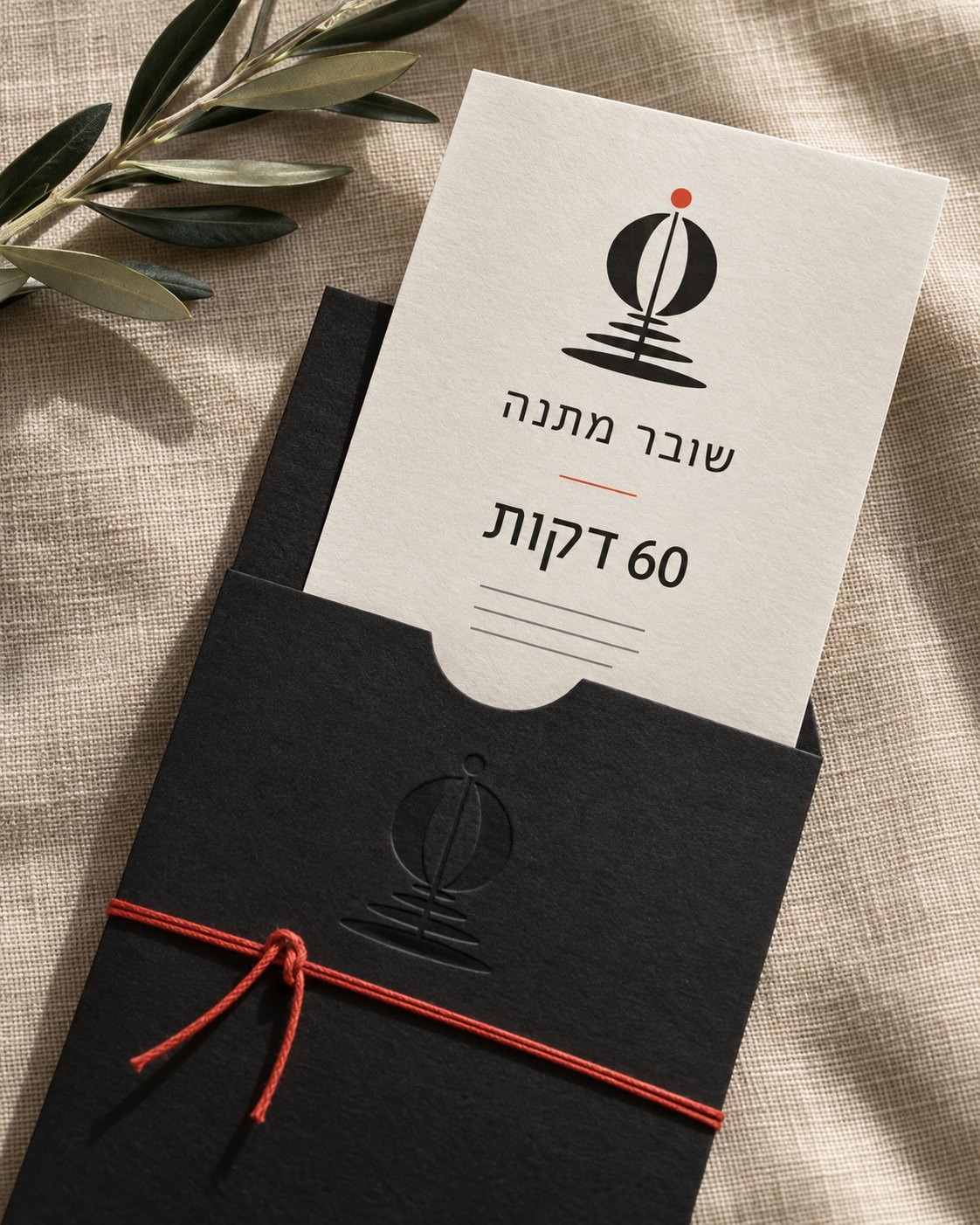
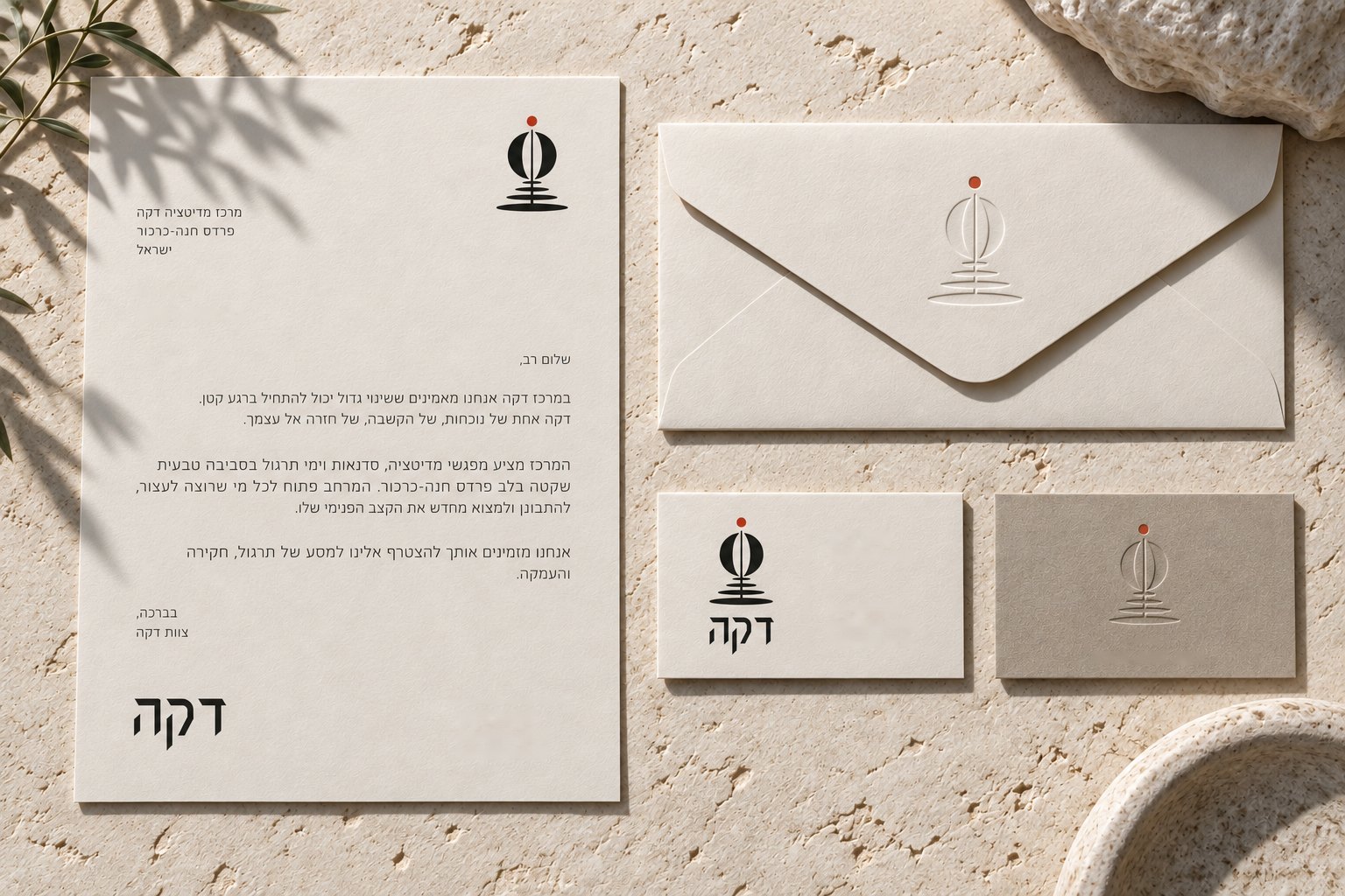
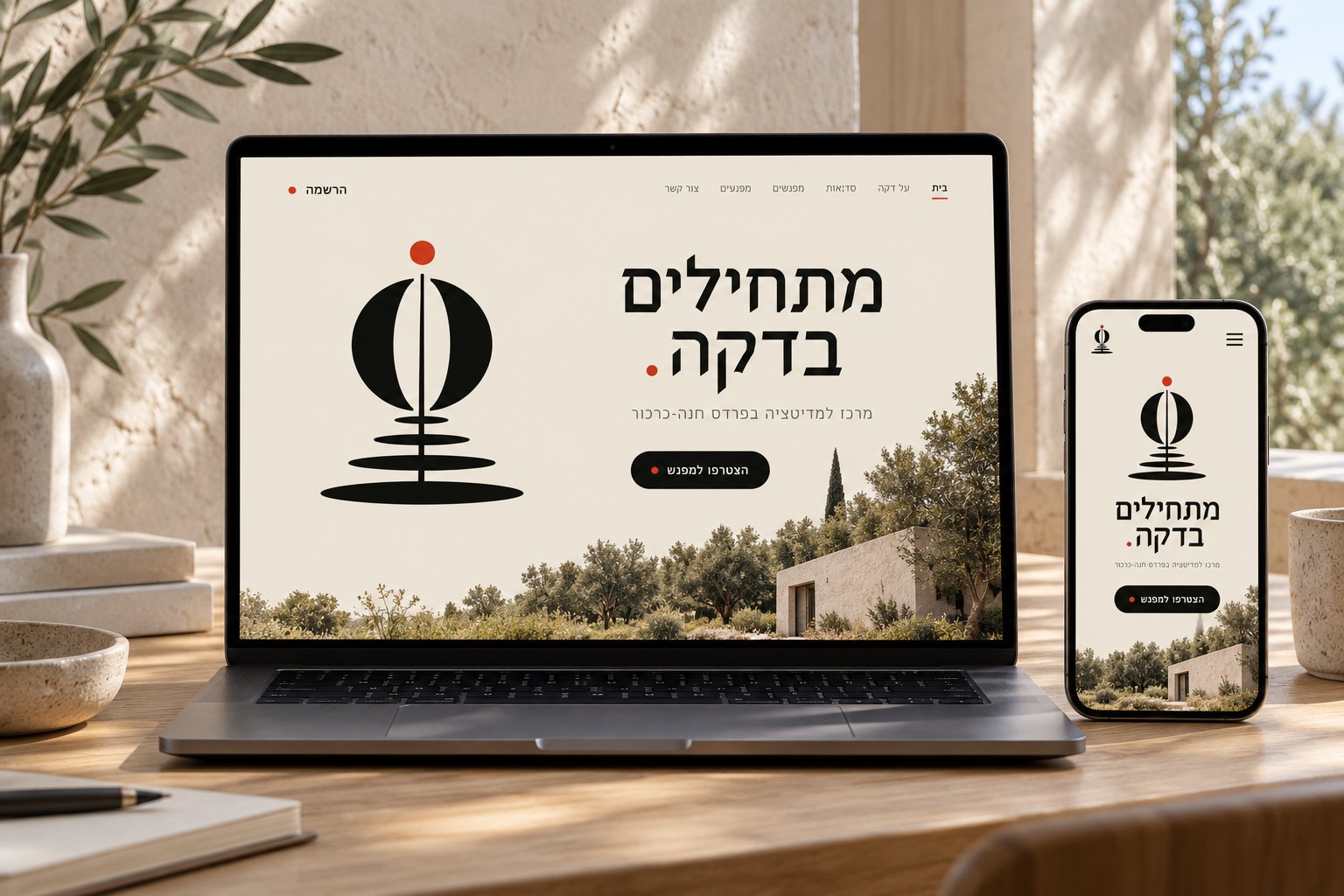
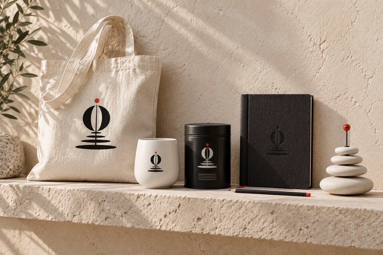
Warm parchment, ink and one red, kept for the dot. The system runs from the entrance and the courtyard through the halls and the reception to stationery, the gift voucher, the landing page and souvenirs.